
Hello reader, for this post I am going to show you how to combine the Relative Strength Index (RSI) and Average Directional Index (ADX) to spot signals on when to enter a trade.
Back then, I would use the Directional Movement (DMI) indicator for confirming trend direction aside from what the price action is giving me but when I think about it, more lines f**k up my decision making. So here’s what the transition looked like. 😂
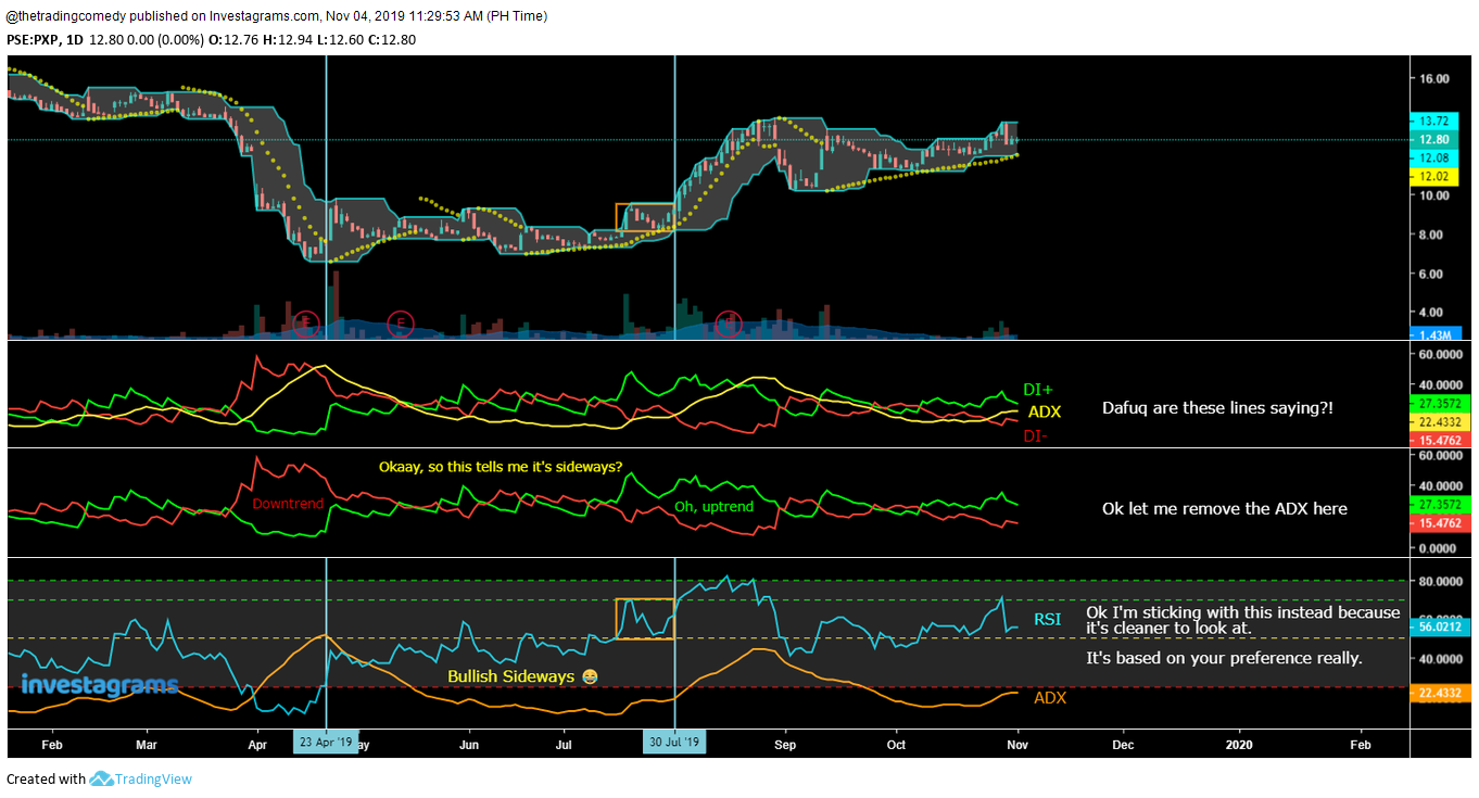
2nd section: Directional Movement
3rd section: Directional Movement (without the ADX)
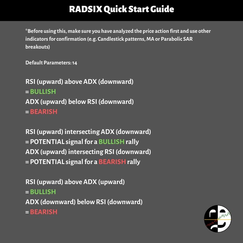
4th section: RADSIX 😁😁😁
Sorry for startling you reader, let me clean this up so you could get that sense of clarity.
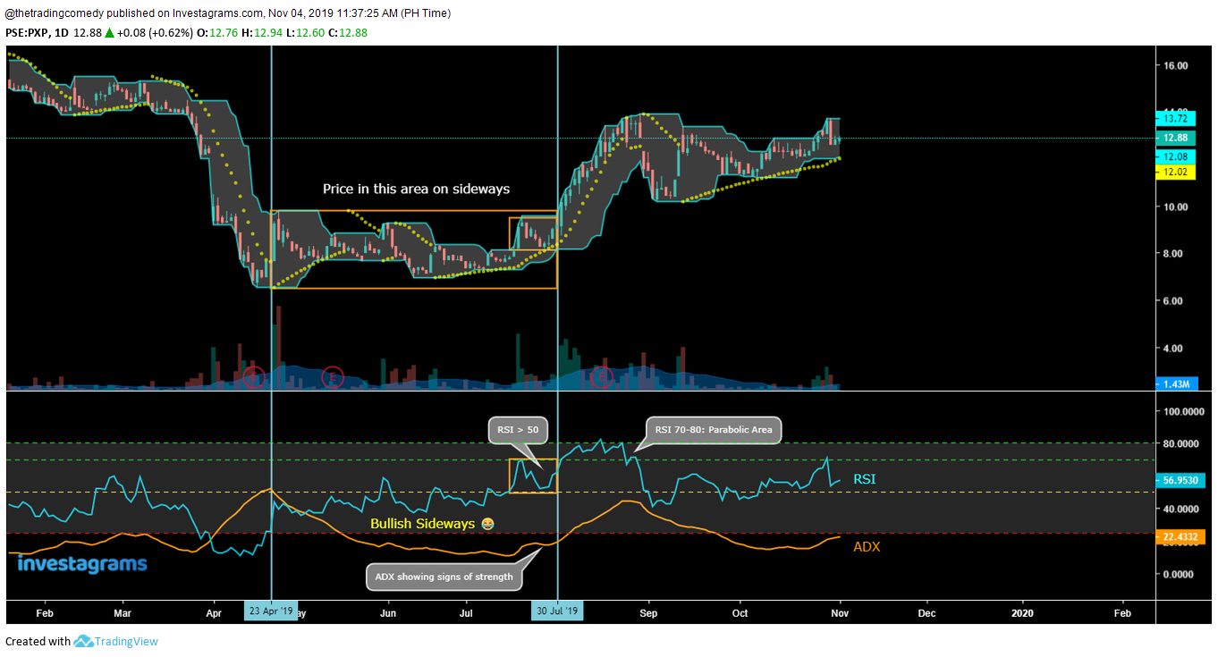
I will be summarizing it in this quick guide below (with chart examples of course! 😁✌)
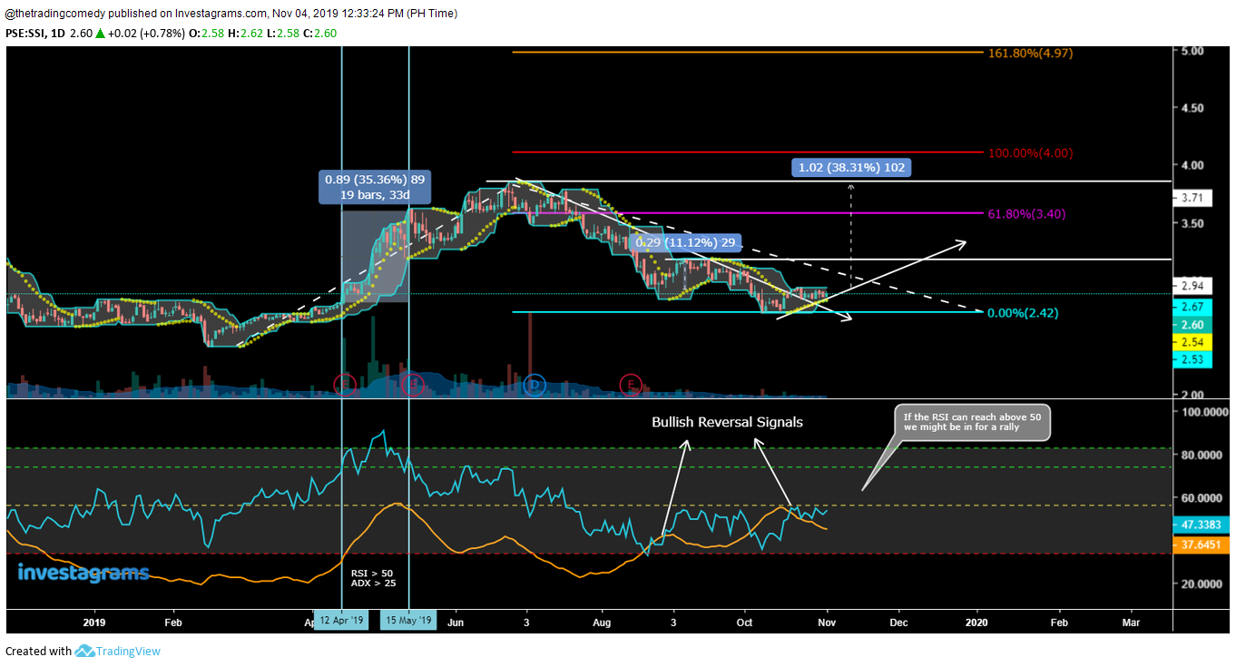
to price action for this to work in your favor.
This template is more ideal for spotting LONG opportunities. Shorting opportunities using this template show up rarely (at least in the PSE, except when you’re trading more volatile markets like Forex and Crypto) so it’s best to use price action for spotting short opportunities along with either the RSI or ADX.
The indicators used are the following:
- Donchian Channel (10)
- Parabolic SAR (0.02, 0.02, 0.2, Default)
- RSI (14, Default)
- ADX (14, 14, Default)
- Optional: MA/EMA 10/20/50/100/200 depending on what trend you want to filter
Personally, I rarely use MA’s now because of psychological barriers with my trade planning.
The Donchian Channels should be enough already to what levels I should be looking for (+ Fibonacci Retracements if I’m going to apply my lazy approach Elliott Wave Theory which I would probably save for another post)
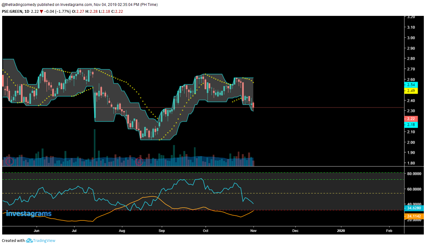
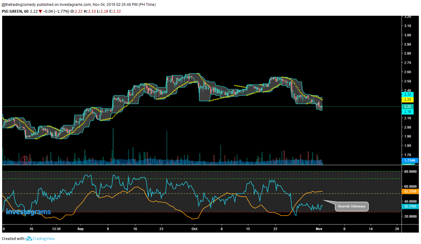
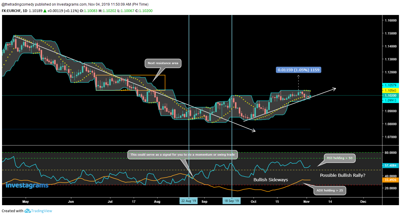
And now some chart examples so you could see how it’s done:
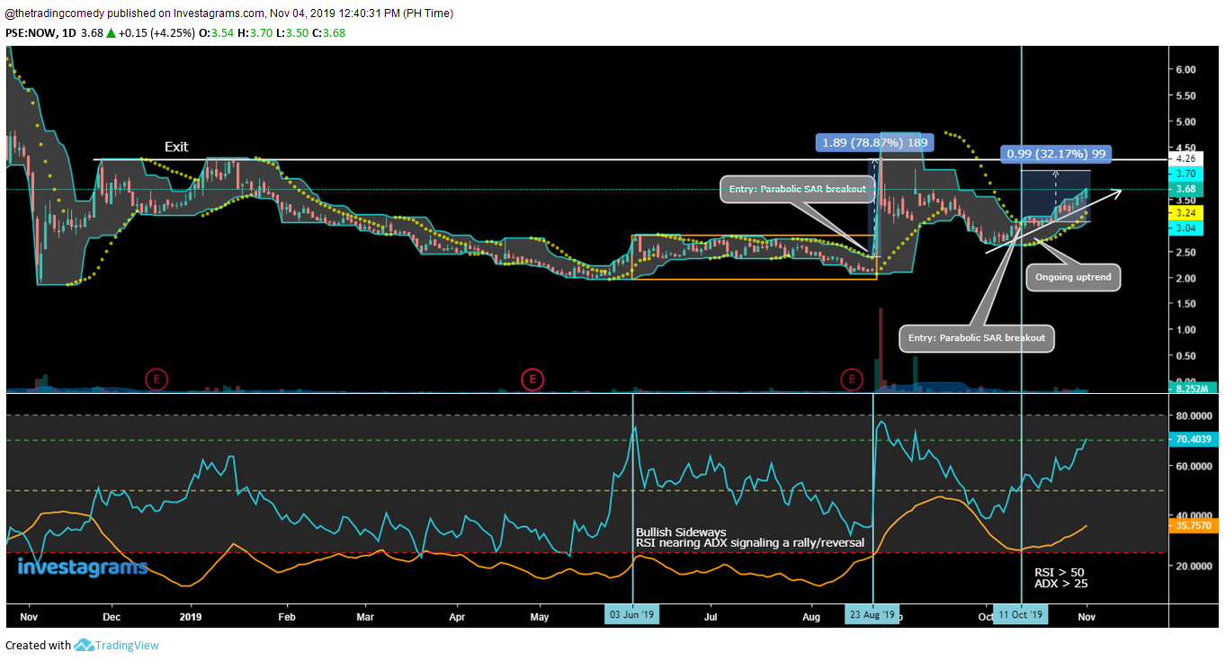
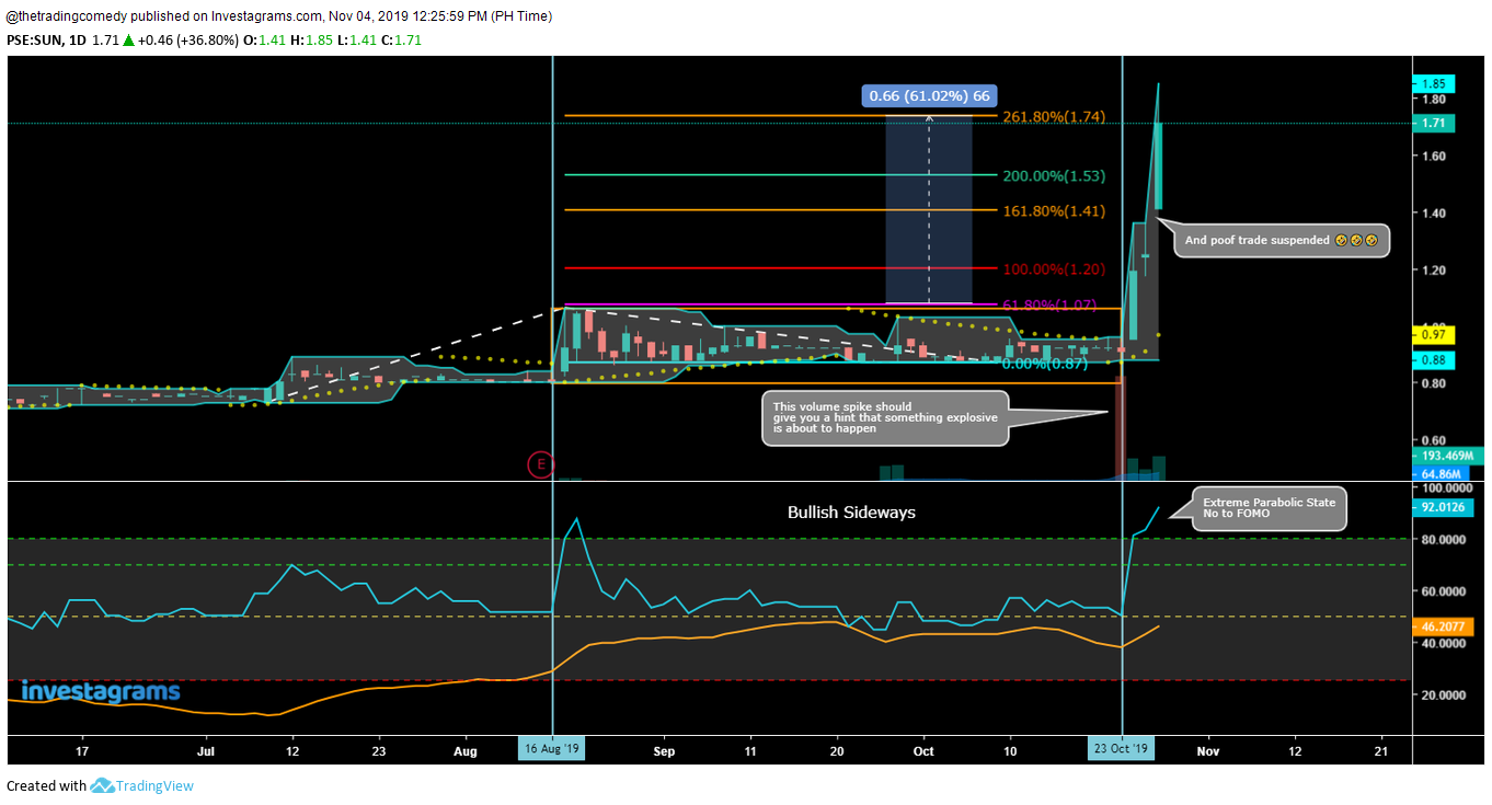
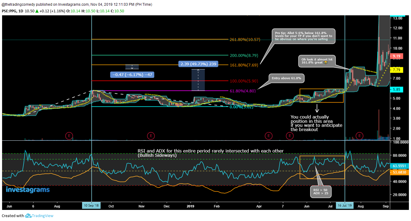
more exciting to watch when it broke out 😂
Oh and if you want to level up your analysis skills using this trading template, you could try out reading forex charts for fun like this example below:
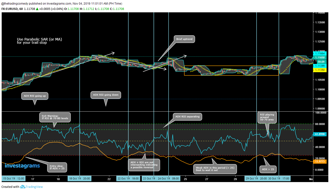

I’m using actually works for inspirational purposes. Risk managed I guess. 😂
I hope this post helps with your trading journey and good luck!
Happy backtesting! 😁
This post is inspired by hitting 3,000 followers on my Facebook page and closely hitting 1,000 subscribers on my YouTube channel. 😂
